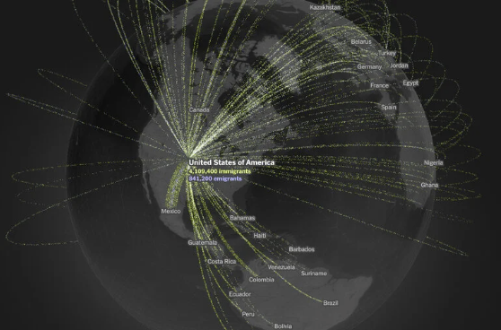
Data visualization by The New York Times: “In the maps below, Times Opinion can provide the clearest picture to date of how people move across the globe: a record of permanent migration to and from 181 countries based on a single, consistent source of information, for every month from the beginning of 2019 through the end of 2022. These estimates are drawn not from government records but from the location data of three billion anonymized Facebook users all over the world.
The analysis — the result of new research published on Wednesday from Meta, the University of Hong Kong and Harvard University — reveals migration’s true global sweep. And yes, it excludes business travelers and tourists: Only people who remain in their destination country for more than a year are counted as migrants here.
The data comes with some limitations. Migration to and from certain countries that have banned or restricted the use of Facebook, including China, Iran and Cuba, is not included in this data set, and it’s impossible to know each migrant’s legal status. Nevertheless, this is the first time that estimates of global migration flows have been made publicly available at this scale. The researchers found that from 2019 to 2022, an annual average of 30 million people — approximately one-third of a percent of the world’s population — migrated each year.
If you would like to see the data behind this analysis for yourself, we made an interactive tool that you can use to explore the full data set…(More)”